Goodman Real Estate
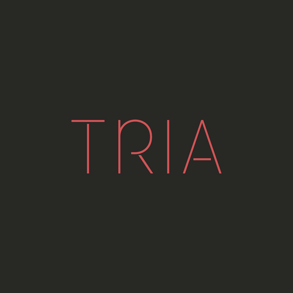
Tria apartments brand
Existing Newcastle, WA Class A apartment required a brand strategy and a logo and website refresh to showcase its strengths and story, and to enhance its distinctiveness in an emerging Eastside suburban market
Services provided
- —Brand strategy, including: resident analysis, market analysis, robust competitive analysis, and positioning
- —Logo refresh
- —Website refresh
Positioning
Tria is perfect for those who seek something better.
For those who demand the best. Yesterday. Today. And tomorrow.With an intimate footprint, stylish design and boutique service at every turn, it’s an ideal home for your exciting journey. Located in convenient and lush Newcastle, the Eastside’s best kept secret.Experience the trifecta you’ve been looking for.
Welcome to Tria.
Project highlights
Signage